Part 2: Decades on the Track: The Rise, Peak, and Shift of the ECI Pro Stock Tour

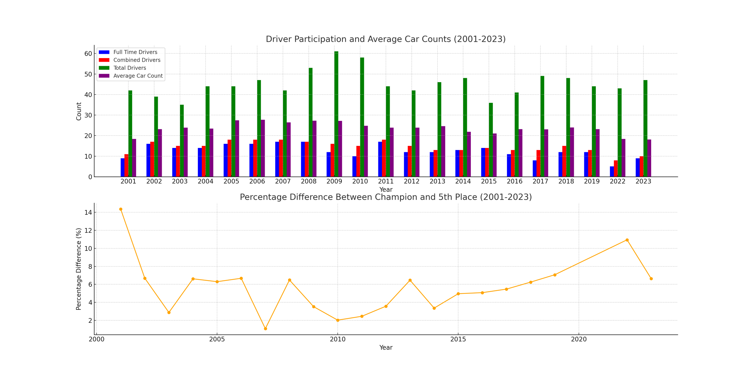
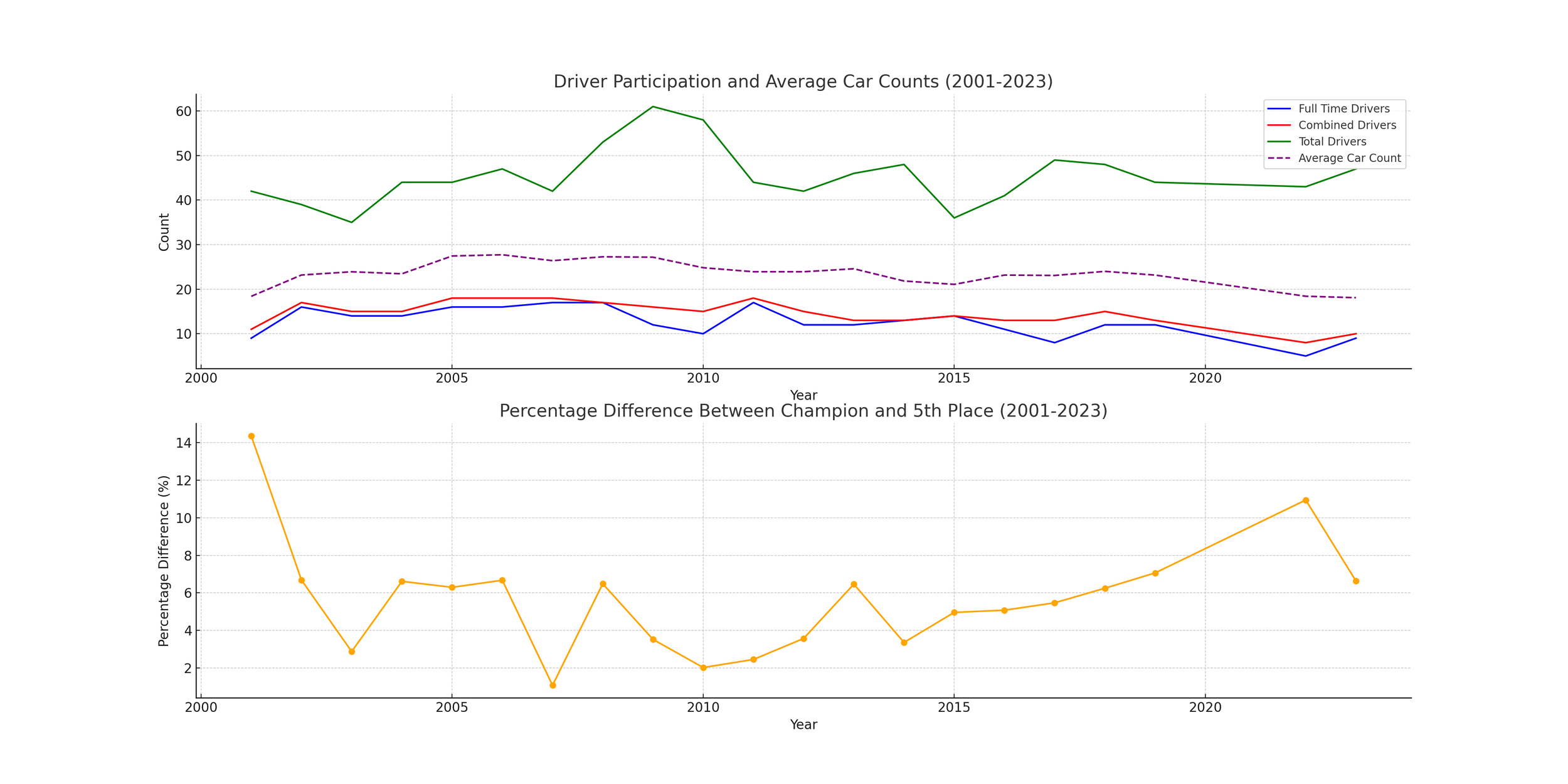
Full Time Drivers = Drivers who have raced in all races on the schedule that year.
Combined Drivers = Drivers who have raced in all races on the schedule that year, plus drivers who have raced in all except for 1 race on the schedule that year.
Total Drivers = Total number of cars to have competed in at least one race during that season.
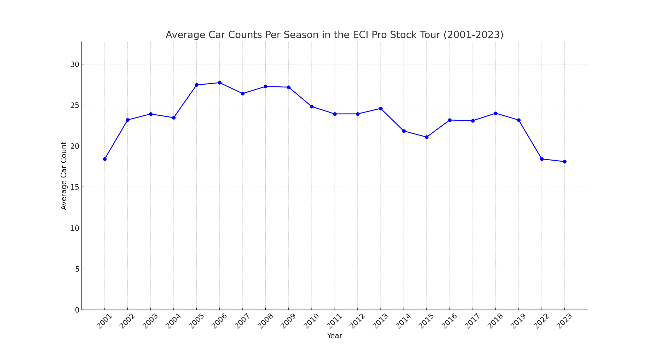
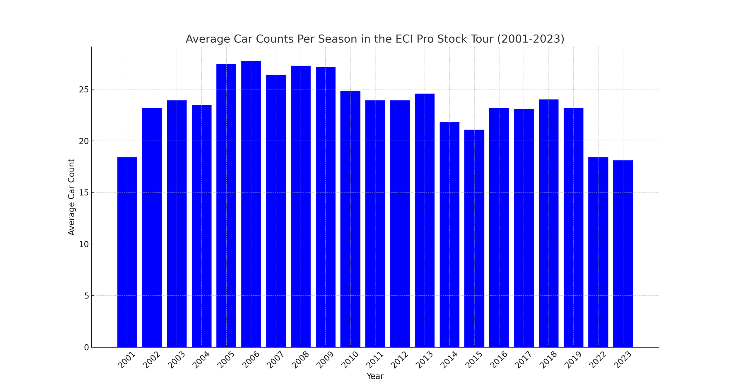
Average Car Count = Average number of total cars per race, for that season.
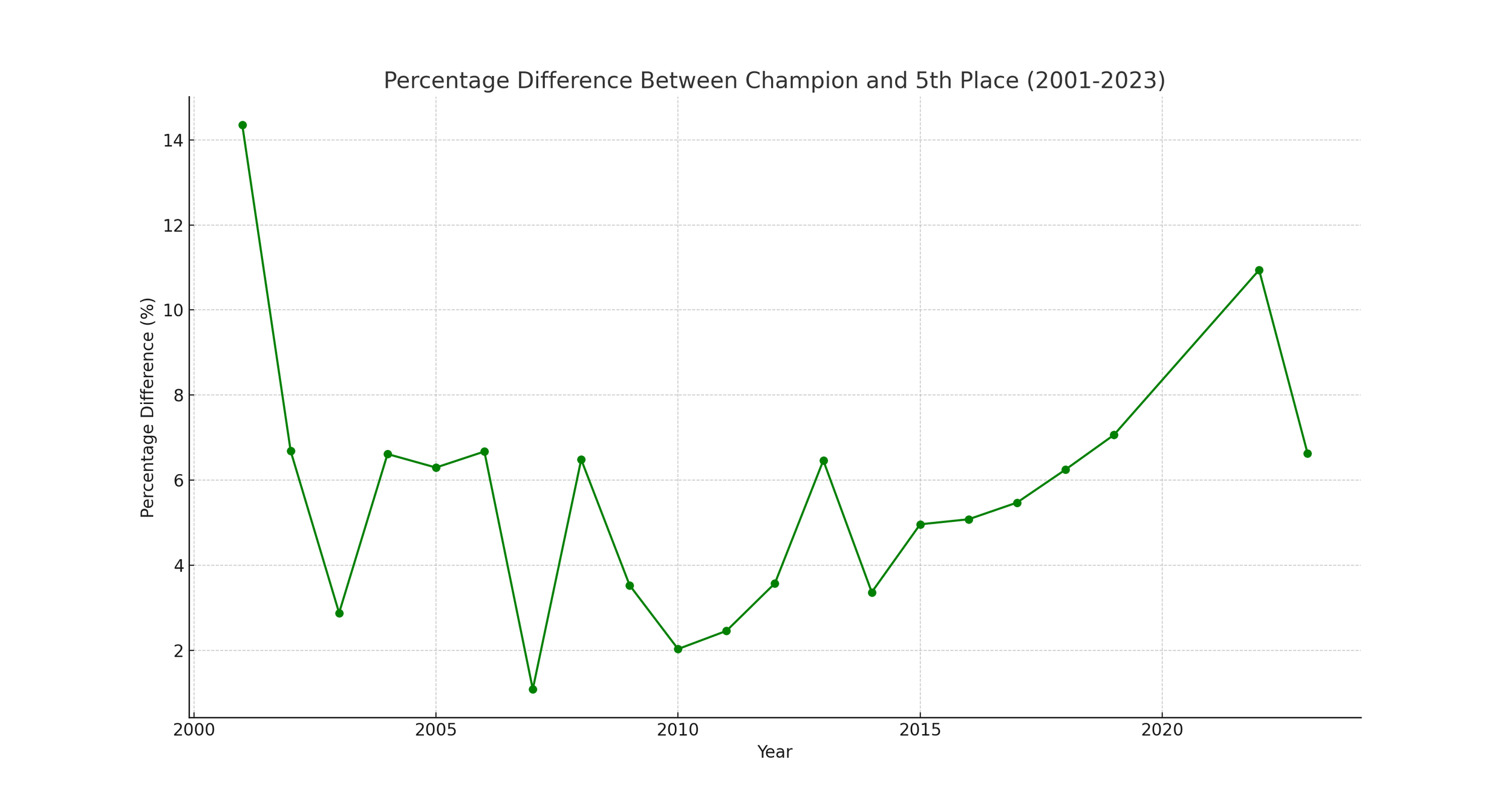
Percentage Difference = You take the season Champion’s point total, and figure out what % higher than the 5th place finisher in the standings had for a point total. This is to provide an idea of how competitive the championship is.
February 19th, 2024
If you have not already looked at the first part, I suggest that you do so, so that you have an idea of what has already been established. You can find that here: https://www.maritimelatemodels.ca/articles/decades-on-the-track-the-rise-peak-and-shift-of-the-eci-pro-stock-tour
Introduction
The East Coast International Pro Stock Tour, pivotal in Canadian Motorsports, has witnessed significant shifts from 2001 to 2023. This analysis explores the trends in driver participation, average car counts, and points spread between the champion and fifth-place finishers, seeking to unravel the complexities of competitiveness and engagement within the series.
Let us start by looking at some images, and then break them down, and integrate them after.

While this may appear alarming, and whether it is or is not, is a matter of opinion, I will highlight how adjustments can make visually displayed statistics appear far different, even though the data is the same. I will now show an image of the same data, but where the range of average car count starts at 0.
Section 1: Methodology and Data Integration
Data encompassing driver participation categories, average car counts per season, and championship points spread was meticulously gathered. Statistical methods such as correlation analysis, moving averages, and trend comparisons were employed to provide an in-depth understanding of the series dynamics, based on information that I was able to find publicly.
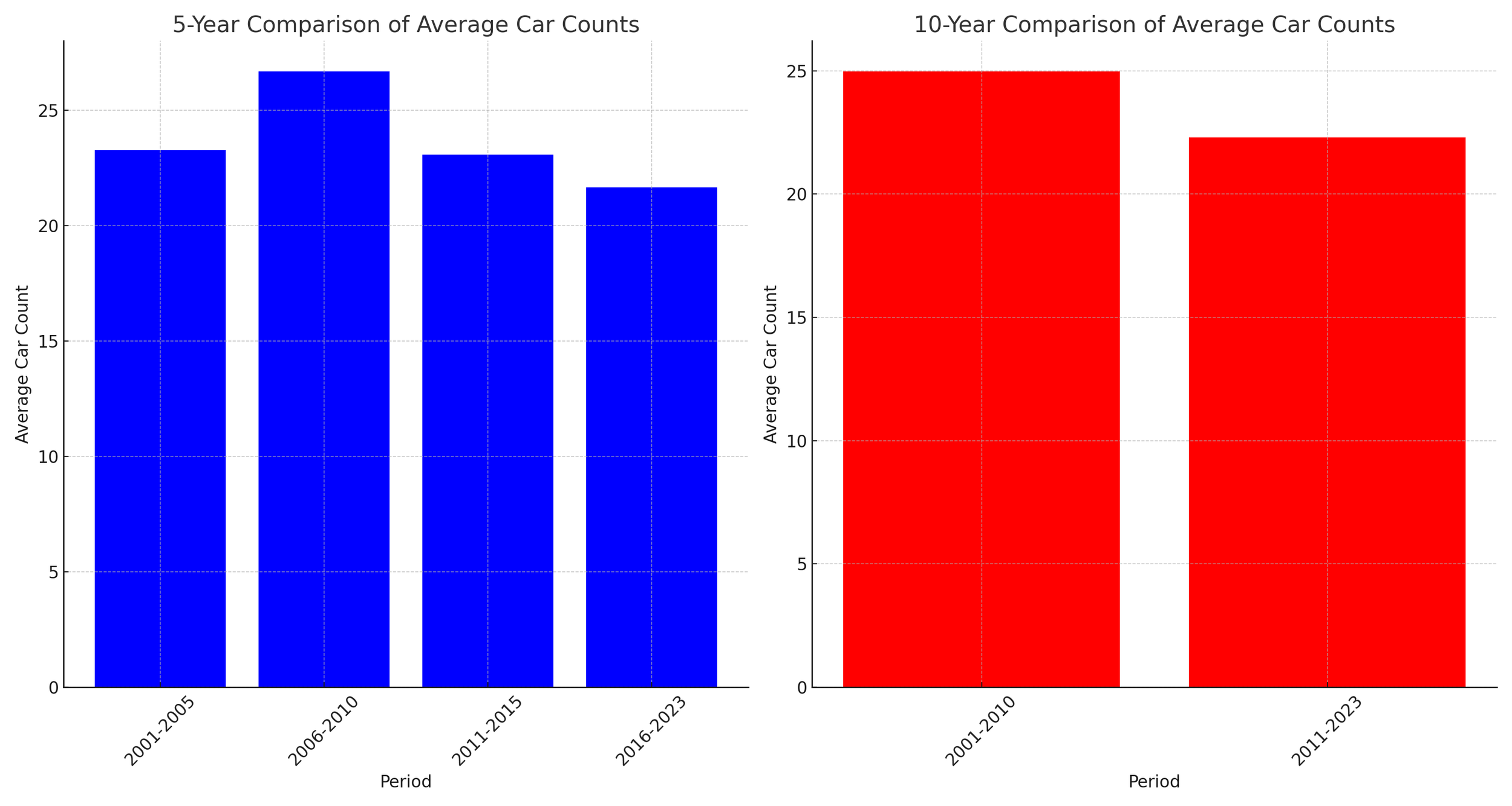
Section 2: Average Car Counts and Series Competitiveness
Average car counts per season demonstrated a strong correlation with series competitiveness. Although note that measuring ‘series competitiveness’ can be done many ways, and it is not a fixed, hard science quantity. My method was to take the number of points that the winner of each season had, and then take the number of points that the 5th place finishing driver in points race had each season. Then I would calculate how many % higher the champion’s points were, over the 5th place finisher. This helped to deal with either different points formats, or years with different numbers of races/points available. 5th place was an arbitrary choice, as I wanted to select a decent number of cars to measure competitiveness across, but not too many.
Another important note is that correlation does not always imply causation. In this case, though, it seems pretty compelling as an important contributing factor.
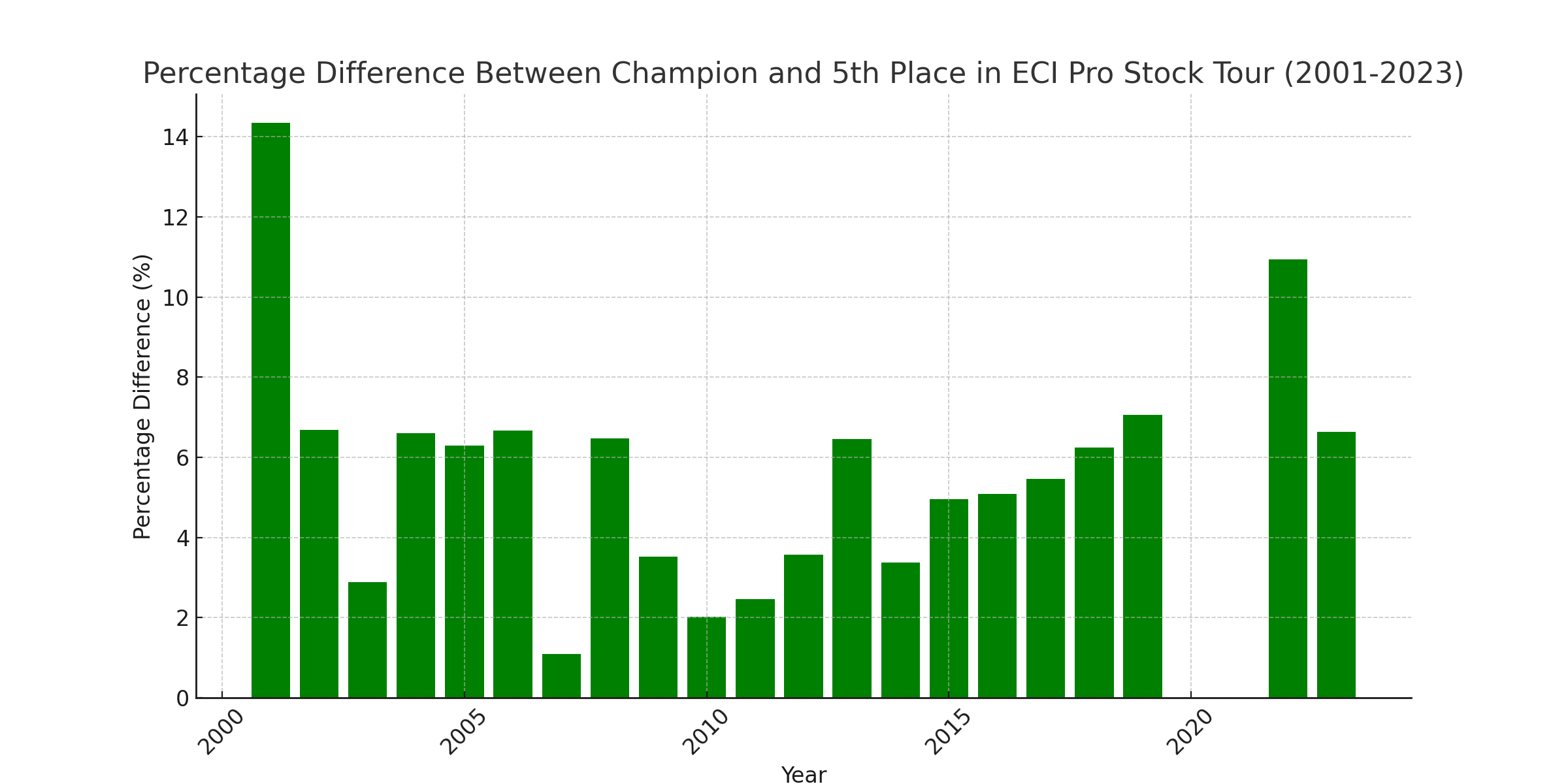
Note the % difference on the left - meaning that the smaller the bar, the closer the championship race was between 1st and 5th. Some years may have had a closer gap between 1st and 2nd for example, but I believe 5th is a pretty good measuring stick position for a proxy to overall competition level. I have once again omitted 2020 & 2021, due to the particularly significant impacts of COVID, and I don’t want that to skew the data too disproportionately.
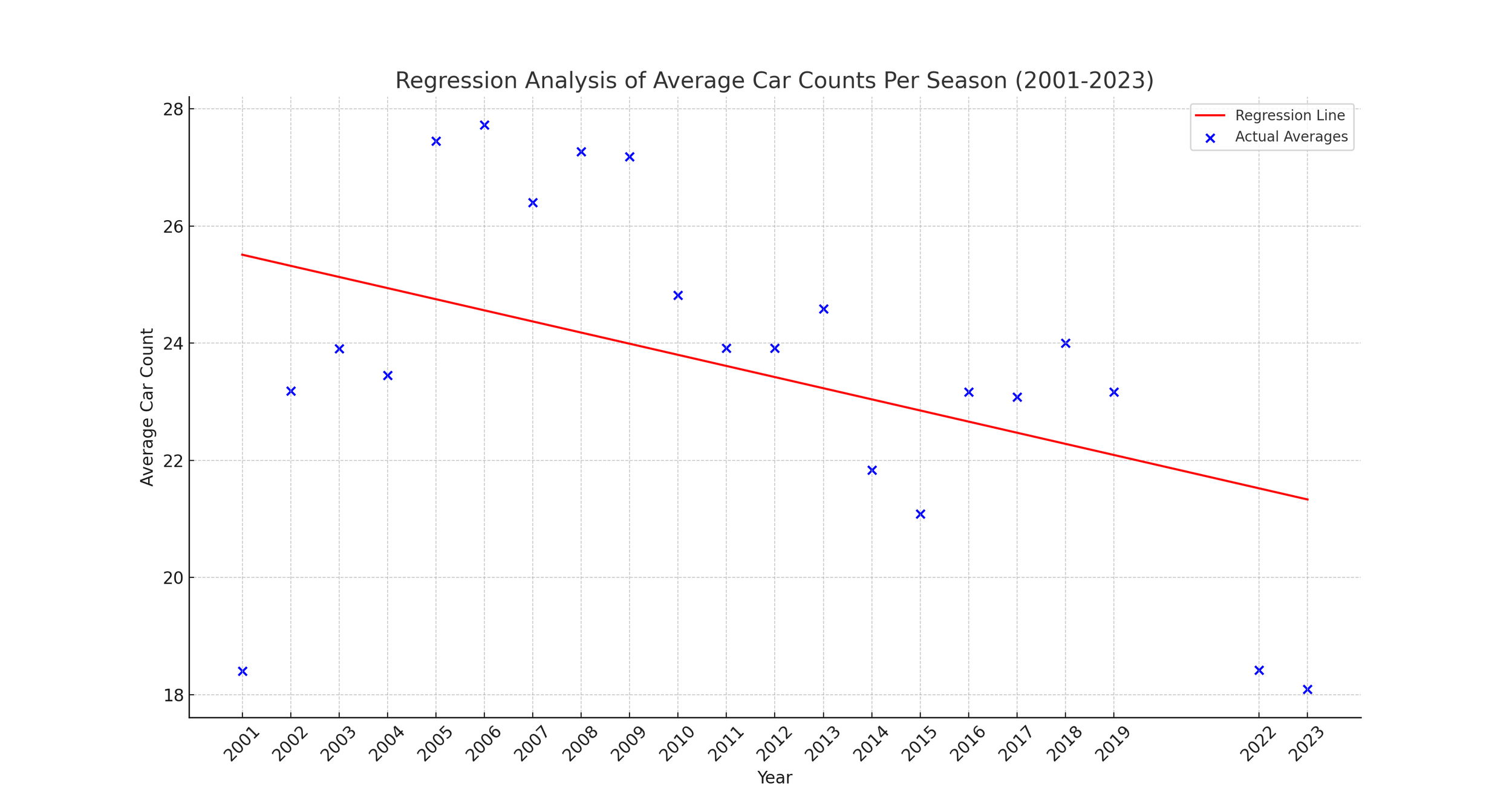
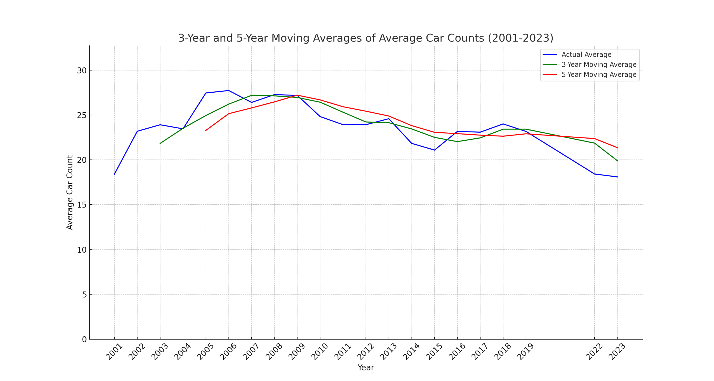
Section 3: Moving Averages and Yearly Comparisons
Moving averages over 3-year and 5-year spans can help out fluctuations, revealing more consistent trends. The 5-year and decade comparisons further highlighted periods of peak participation and competitiveness within the series.


Section 4: Correlation Analysis and Interpretation
Correlation findings varied in strength, with the strongest observed in the combined driver category. While these correlations are insightful, it is crucial to note that they do not imply causation. The subtleties in these statistical relationships open up avenues for further exploration.
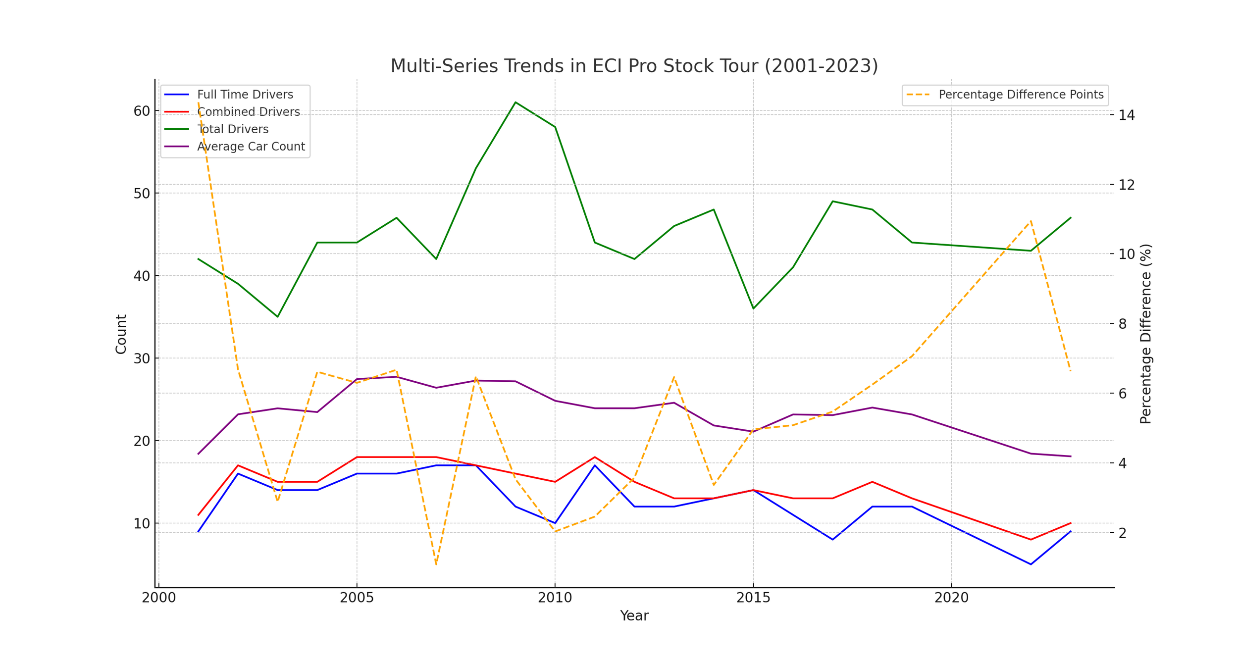
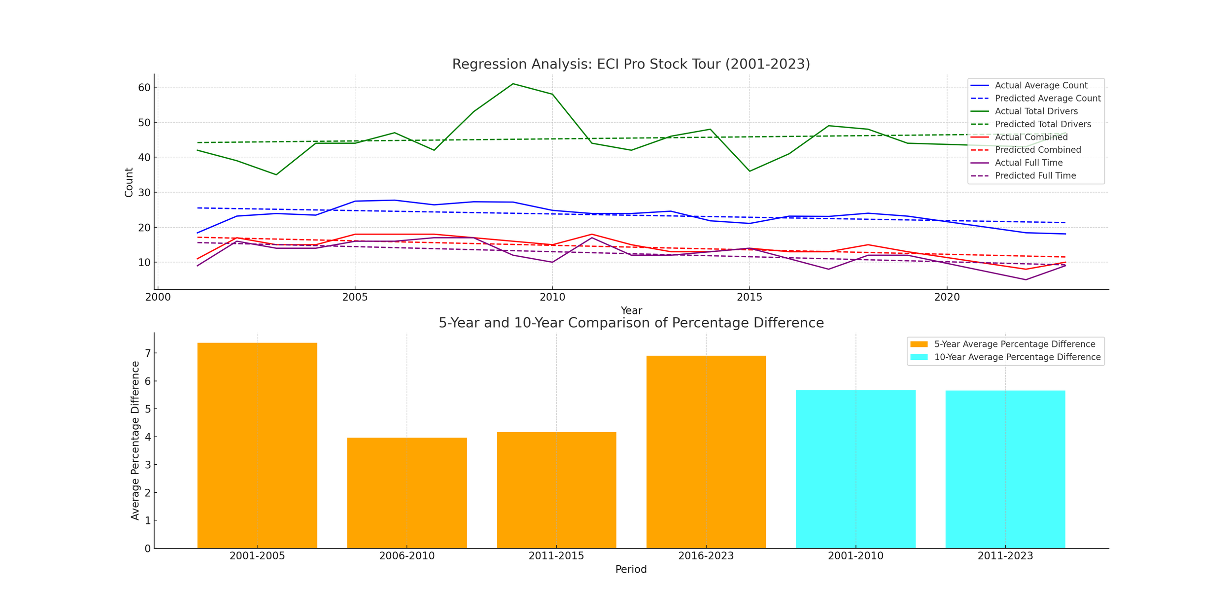
I will offer several looks at this in different ways, so it is easier to see. But we see a clear correlation between years with more cars, and a lower % gap in points between 1st and 5th place finishers, used as a proxy for series competitiveness.
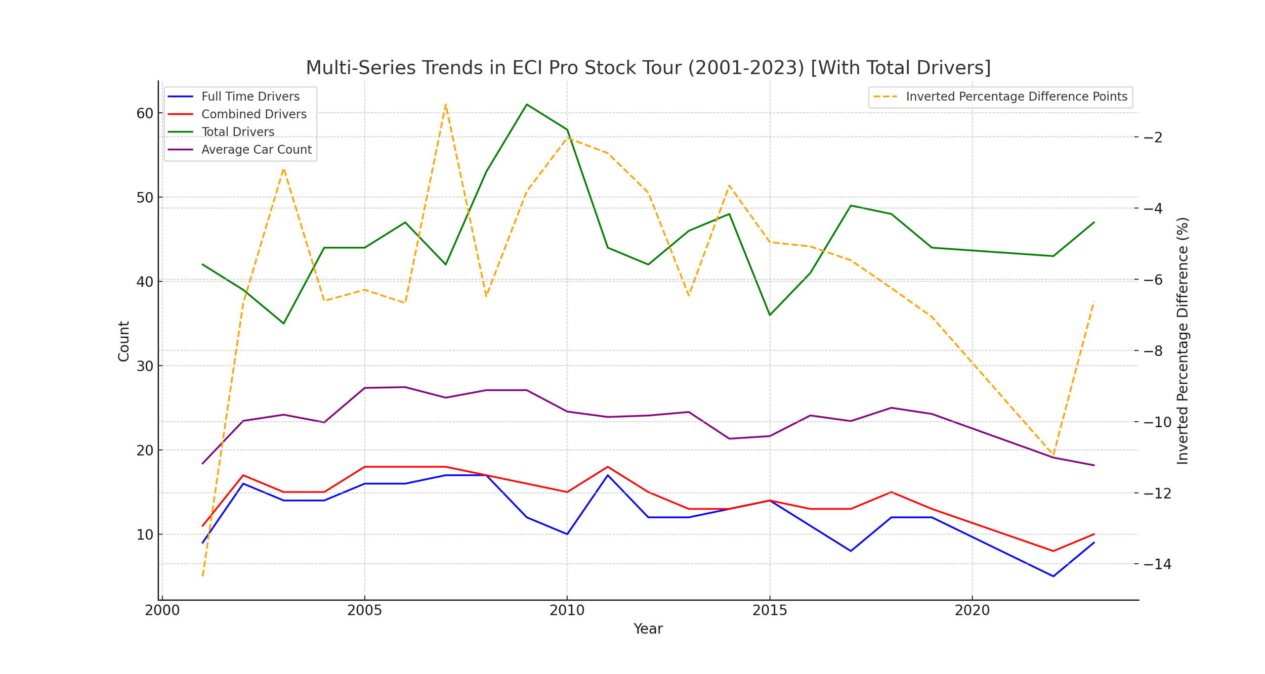
I’ve inverted the scale for the percentage difference, so that they go the same direction when they correlate more closely. This time, the dotted yellow line being higher up, implies a closer level of competition through the field.
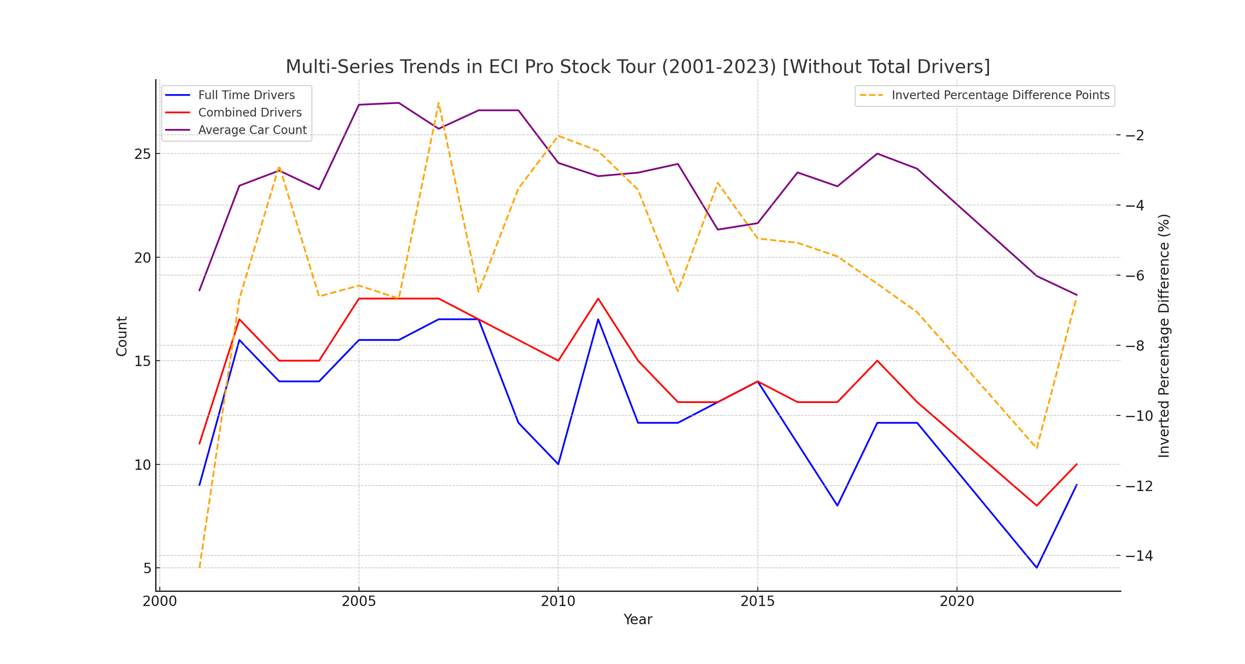
To get a more focused view, I’ve removed the Total Driver category. As we will see later, anyway, that category had the weakest correlation. Here, we can see quite a bit of similarity in peaks and troughs.
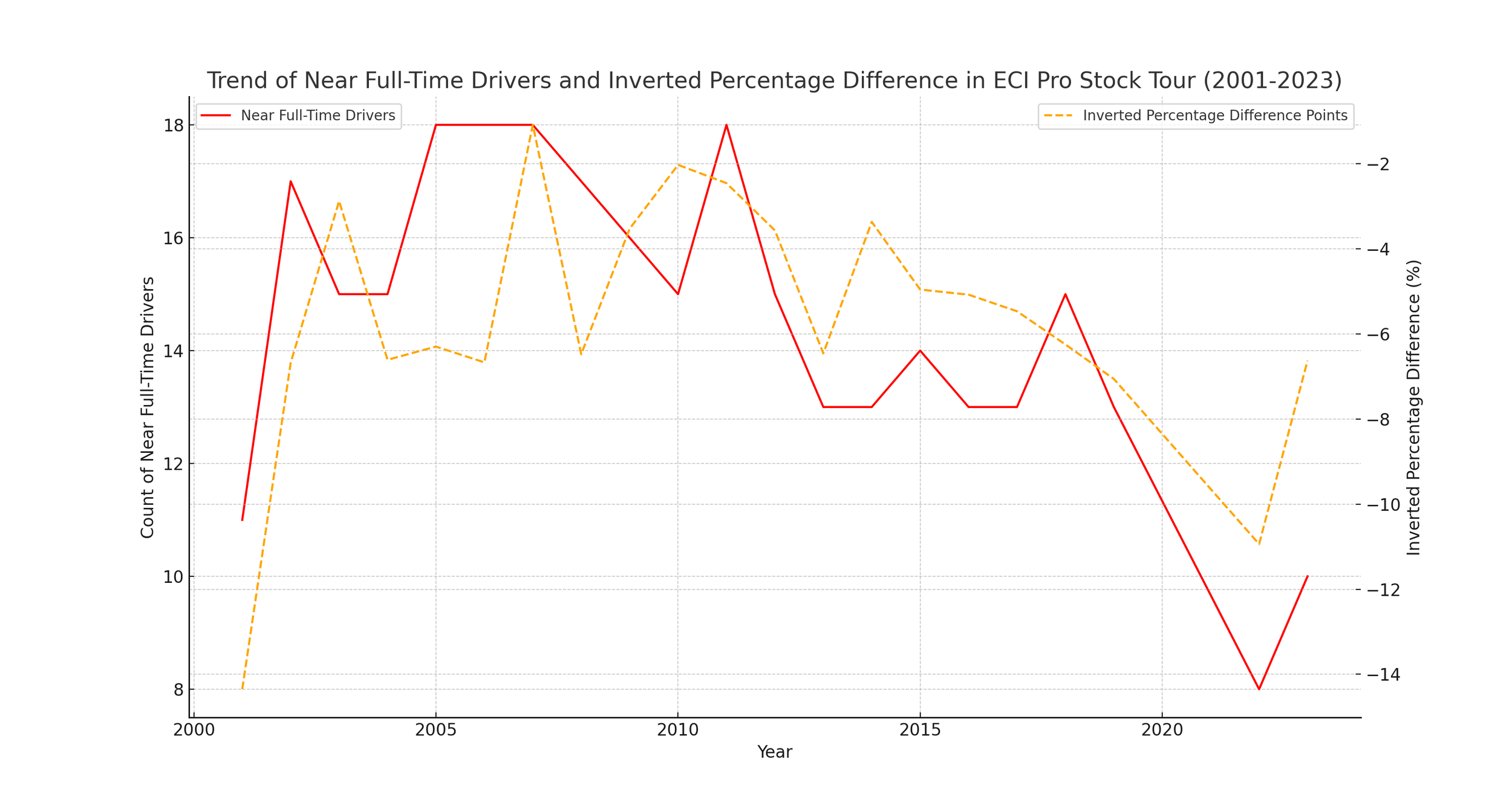
Here we have isolated only the category most closely correlated - the number of drivers to run all races, and all races except for 1 combined, juxtaposed to the closeness in points between 1st and 5th place on the tour. It is impressively similar.
Now we are going to calculate hard numbers as far as correlation goes, starting with a correlation matrix heatmap.
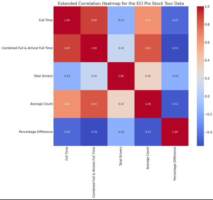
If you aren’t sure what you are looking at, it will be explained.


Essentially, the further the bar extends downward, the more highly it correlates with the level of competition.
The correlation between peak years of driver participation and competition parity in the ECI Pro Stock Tour could indicate a dynamic relationship between the level of competition and the number of participants. Let's explore this further:
Analyzing the Correlation
Peak Participation and Competitive Parity: During the years when driver participation was at its peak, there was likely a larger pool of competitive drivers. This could lead to closer races and a more competitive championship, as evidenced by smaller point differences between the champion and 5th place finishers.
High Participation Driving Competition: Higher participation rates often bring a diverse range of skill levels and experience, which can enhance the competitiveness of the series. More drivers vying for top positions naturally tightens the competition.
Years with Closer Point Differences: For example, in years like 2007 and 2010, where the point difference was relatively low (1.09% and 2.03%, respectively), it could indicate that the series experienced highly competitive seasons. These years align strongly with higher driver participation rates.
Impact on Series Dynamics: High participation and competitive parity are likely interlinked and beneficial for the series. They can enhance the overall appeal of the series to fans, sponsors, and new drivers, contributing to its growth and sustainability.
Contrast with Less Competitive Years: In contrast, years with a larger gap in points (e.g., 2001 and 2022) might suggest less competition at the top, which correlate with different participation dynamics.
The correlation between peak years of driver participation and competition parity in the ECI Pro Stock Tour could indicate a dynamic relationship between the level of competition and the number of participants. Let's explore this further:
Understanding Correlation vs. Causation
Correlation: In our analysis, we observed a potential correlation between peak years of driver participation and competition parity (as indicated by the close point differences between the champion and 5th place finishers). This correlation suggests a relationship where years with higher participation might coincide with more competitive seasons.
Causation: However, establishing causation would require proving that one of these factors directly causes the other. For instance, it would mean showing that higher driver participation directly leads to more competitive seasons, or vice versa.
Other Influencing Factors: There could be various other factors influencing both driver participation and competition parity, as well as considering that my selection of measure for competitive parity is not an objectively quantifiable variable. These other influences might include economic conditions, technological advancements in racing, or even broader trends in motorsports' popularity.
Considerations for Analysis
Further Investigation: To establish causation, one would need to conduct more in-depth studies, possibly involving experimental or longitudinal research methods. This is frankly not very realistic for this type of endeavour, so I am doing my best with what I have.
Holistic View: It's beneficial to consider the broader context of the racing series, including economic, technological, and cultural factors, to understand the full spectrum of influences on both driver participation and competition parity.
Re-visiting the correlation heatmaps/coefficients
Correlation Coefficient: This is a statistical measure that describes the extent of a linear relationship between two variables. It ranges from -1 to +1.
+1: A perfect positive correlation. As one variable increases, the other also increases at the same rate.
0: No correlation. The variables do not influence each other.
-1: A perfect negative correlation. As one variable increases, the other decreases at the same rate.
Magnitude and Significance:
Values close to +1 or -1 indicate a strong relationship.
Values close to 0 suggest a weak or no relationship.
The sign (positive or negative) indicates the direction of the relationship.
The correlation analysis of the ECI Pro Stock Tour data shows the following in terms of the strength and closeness of the relationships:
Combined Full-Time & Almost Full-Time Drivers: This has the closest correlation with the percentage difference in points. It suggests that the competitiveness of the series, as indicated by the points gap between the champion and the 5th place finisher, is most closely related to the number of drivers who participate either in the full series or miss only one race. A stronger correlation here implies that the core group of committed drivers has a significant impact on the competitive dynamics of the series.
Average Car Count: The second strongest correlation is with the average car count per season. This indicates that the overall turnout at events also relates significantly to the competitiveness of the series. Higher car counts might contribute to a more competitive environment, influencing the points spread among the top finishers.
Full-Time Drivers: The correlation with full-time drivers, while still significant, is slightly less than with combined drivers and average car count. This suggests that while the number of drivers committed to the entire racing season does impact competitiveness, it's the combined category that carries more weight in this aspect.
Total Drivers: There is a noticeable drop-off in correlation strength with the total number of drivers who participate in at least one race. This weaker correlation implies that the sheer number of different drivers participating throughout the season has a less direct impact on how competitive the top positions in the series are.
Overall, these correlations provide insightful perspectives into what factors most strongly influence the competitive nature of the ECI Pro Stock Tour, highlighting the importance of a core group of consistently participating drivers.
Section 5: Conclusions and Implications for the Future
The analysis underscores the evolving landscape of the ECI Pro Stock Tour. Key findings indicate a need for strategies to bolster driver engagement and maintain competitiveness. The implications of these trends extend to all stakeholders, signaling the importance of adaptive approaches for the series' future resilience.